Widgets & Slots
To set up a Widget, you first need to set up one or multiple Recommenders to use for the Slots in the Widget.
To create a new Widget, go to the Website Configurations > Widgets section of the Discovery OS, and click Add New Widgets.
General Styles, Desktop Styles and Mobile Styles are where you can configure some UI styles for the widgets. Included are styles that might be changed quite often so we can configure them easier without making code changes from the FE.
Recommenders tab is required to setup the logic of the results returned in the widget slots
Widget Slot Filters: This will de-dupe slots in a recommendations widget based on configuration criteria set on the back end.
Preview tab is still under development please ignore.
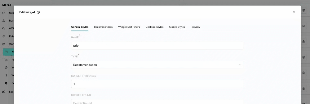
General Styles
This is where we configure some general styles for the widgets, mostly used to set the widget type, location and post impression tracking.
Widget name
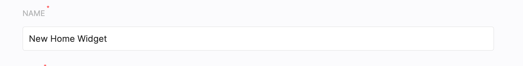
This can be any string to identify the widget. If the widget is a Test configuration, we recommended including TEST in the widget name to differentiate the test widgets and live ones. This name will be used to search in Routes, engagement report or any configuration searching for widgets.
Widget Type
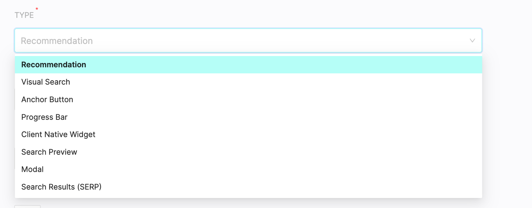
Widget Type available to select in the UI will only be available to client for configuration if the client feature table has been enabled for the corresponding product.
| Widget Type | Usage | |
|---|---|---|
| 1 | Recommendation | Recommendation panels or carousels like Homepage, PLP, PDP, Cart |
| 2 | Modal | Use for pop-up widget like exit intent, and Price Beat |
| 3 | Search Preview | Use for Search Preview widget |
| 4 | Search Results (SERP) | Use for Search Result Page |
| 5 | Bundle | Use for PDP bundle and Pop-up bundle widgets |
| 6 | Merchandising | Use for PLP or for Sponsored Products in Search Results |
| 7 | Visual Search | Use for Visual Search widget (search by image) |
| 8 | Anchor Button | |
| 9 | Progress Bar | Use in minicart/cart page to show the cart value’s progress until it’s applicable for a freeship/discount. |
| 10 | Client Native Widget | Use to track native panel’s behaviour, such as slot impression, click. |
| 11 | Quiz | Use for Quiz widget. |
Display Element
This widget configuration varies depending upon whether the widget is a fixed component/element on a page or a overlay/toast type of widget. The fixed components are called In-Page Elements and will integrate with the webpage so that the element will look like it is part of the page itself.
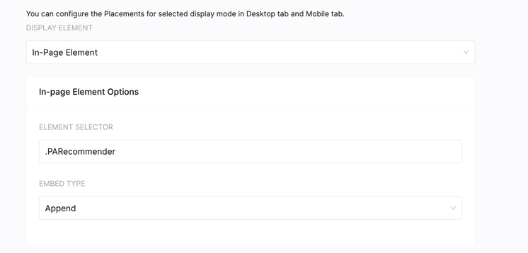 Click to zoom | For In-page Element Options, we need:
|
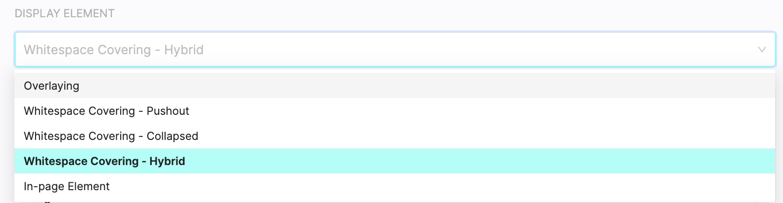 Click to zoom | Overlay Widgets, Whitespace Covering - Hybrid, Pushout, Collapsed are screen elements that are aligned relative to the screen and float over the page contents. Configurable Whitespace Covering Options Margin in px: The margin in px from the widget’s border Element Selector: The element selector where the widget will be displayed on. |
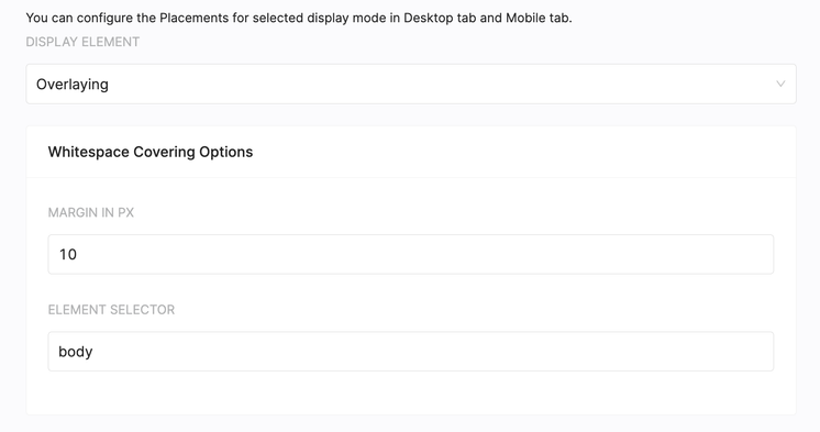 Click to zoom | Configurable Whitespace Covering Options Margin in px: The margin in px from the widget’s border Element Selector: The element selector where the widget will be displayed on. |
Border Thickness, Border Round, Border Color
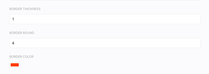 Click to zoom This is the settings for border around the slot | Styles on UI 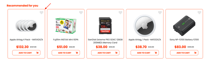 Click to zoom |
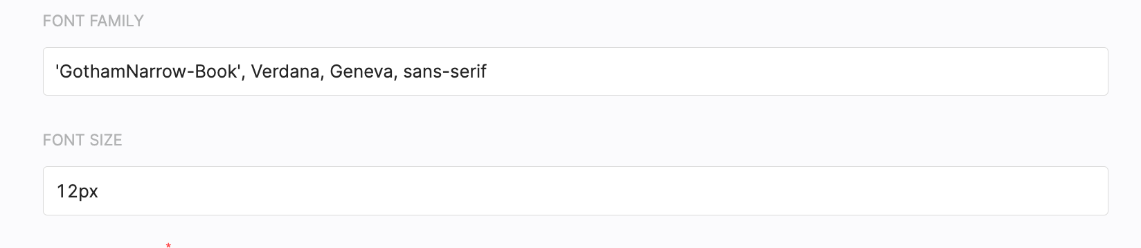
Font Family, Font Size
This is for other elements to inherit font family such as title/ name/ price text.
Fill slot with Product image
When this is selected, the image width and height will be the same as slot’s size.
When this is unselected, you have more configuration control to set specific image width and height:
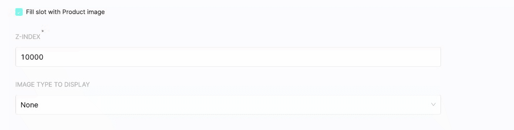
Z-INDEX
Z-index configuration is important for overlay/ modal widgets to decide if PA widgets will be under any other element on the page. The number needed here should be bigger than the z-index of the elements which you want the PA widget to show above.

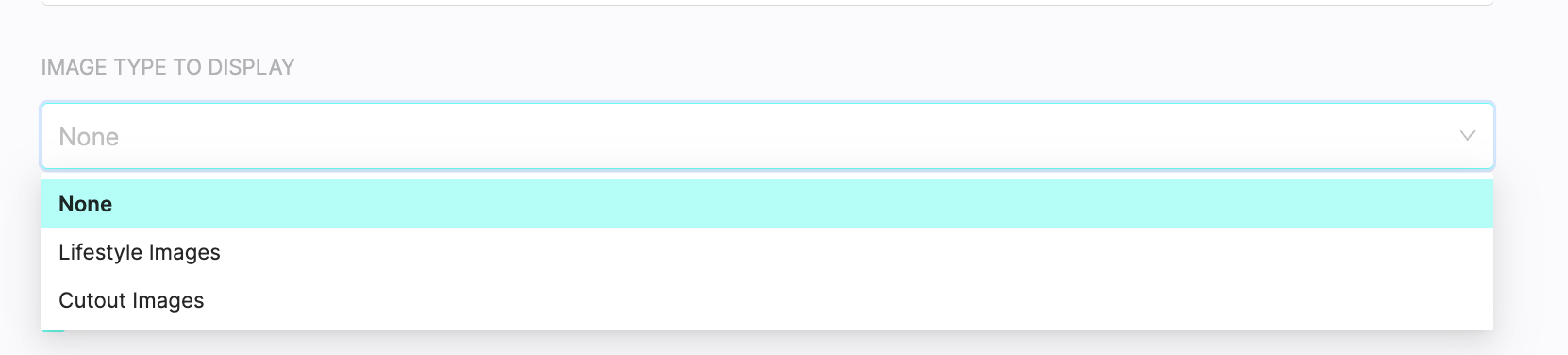
IMAGE TYPE TO DISPLAY
If a website has different image types (cutout and lifestyle) and want to display a certain type on the widget, the configuration can be controlled here. This must be configured in the scoping, onboarding, and catalogue ingestion before it can be used. Default set as none.
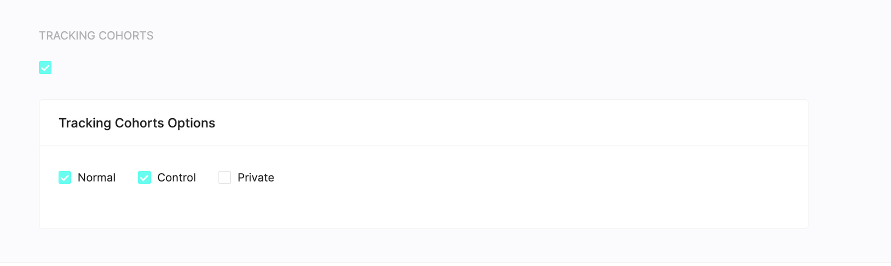
TRACKING COHORTS
For clients integrated via PA managed Javascript this configuration enables post impression tracking for AB testing purposes.
Default unselected.
This is used to enable tracking on the widget area impression. For post impression reporting, select both Normal and Control (private is not in use atm) If enabled, when a customer (Normal or Control depends on what’s selected) scrolls to the point where our widget is meant to display on the page, we fire an event with info of the route Id, widget Id, customer an session ID.
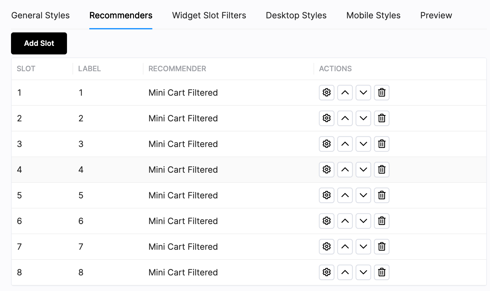
Recommenders
Recommender configuration needs to be set for all Widget types(except for native and button widget).
Recommenders are populated and determine how many slots will be returned in the widget. Recommenders contain campaigns and tactics which determine the logic used for each slot.
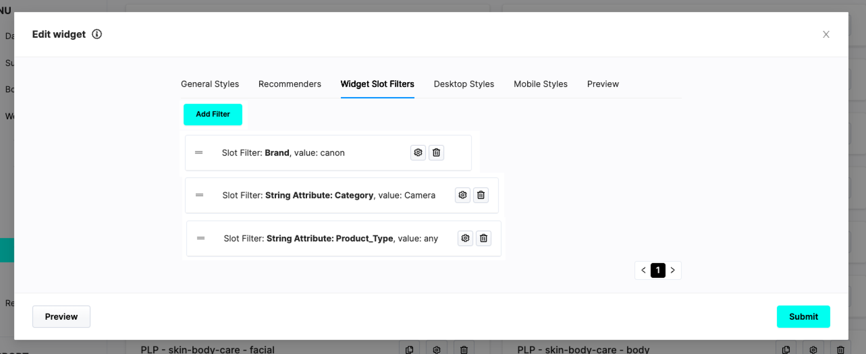
Widget Slot Filters
The widget slot filter will de-dupe slots in a recommendations widget based on configuration criteria set here.
Some examples for using Widget Slot Filter might be to not display multiple items in bundle slots that are duplicative of one another, from the same category, etc.
-
Step 1:
Click ‘Add Filter’ button from new 'Widget Slot Filter' tab on widget config UI
 Click to zoom
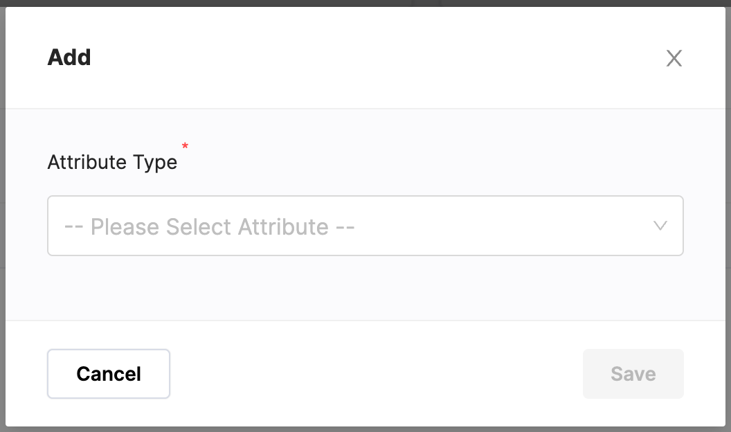
Step 2:
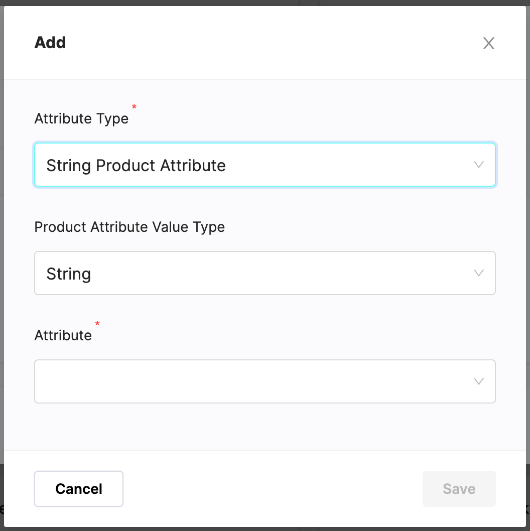
User must select Attribute type. options are limited to Brand, String Product Attributes, and Attribute Options.
 Click to zoom
-
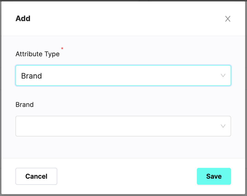
A user selects Brand:
Brand Value drop down appears. User is not required to select a value for brand.
User can either select a value and save, or just save without selecting a value
If selecting a value, only values that match the selection will be de-duped with the Widget Slot Filter. If left blank the de-dupe rule will apply to any value.
 Click to zoom
-
User selects String Product Attribute:
Attribute dropdown appears to display all attribute and attribute options in the PA database.
Attribute Value is disabled until attribute is selected
Once an attribute is selected, SAVE and attribute value UI is enabled.
Attribute value selection is not required to save the filter. If selecting a value, only values that match the selection will be de-duped with the Widget Slot Filter. If left blank the de-dupe rule will apply to any value.
 Click to zoom
Step 3:
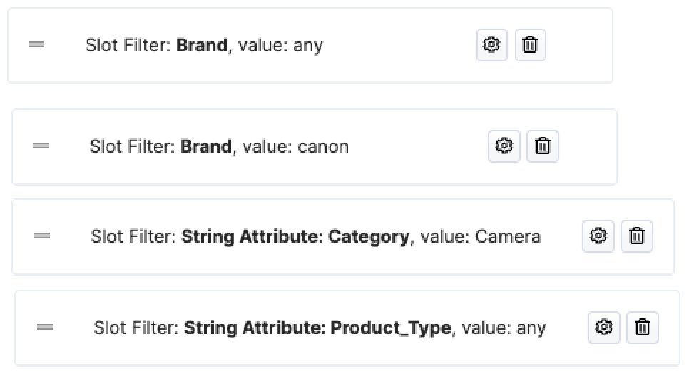
filter is saved and displayed in the Widget slot Filters tab.
Filters are displayed as - Slot Filter: [attribute type] : [Attribute if applicable], value: [value if applicable, display ‘any’ if no value selected]
 Click to zoom
-
Copy Widget
You can easily duplicate a widget within the current website or to other domains of your website.
-
Click on the copy icon of the widget you want to copy from
 Click to zoom
-
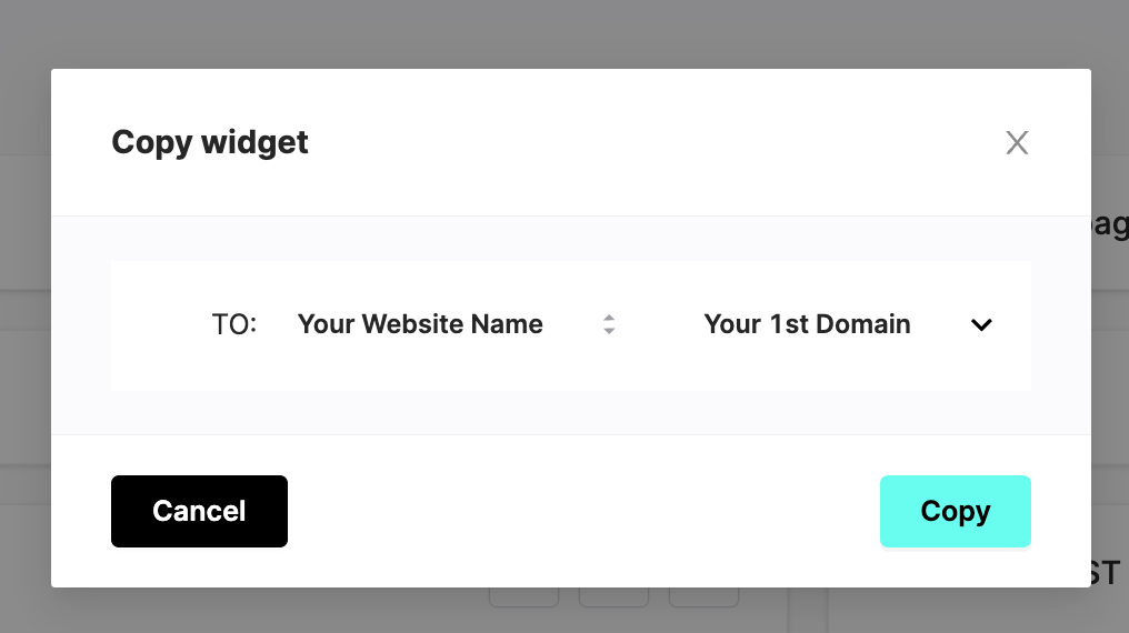
In the next popup, select the domain you want to locate the new widget
 Click to zoom
-
Press Copy button
-
Once complete, you will find the Copied widget in the widget list under the same name with Copy appended.
 Click to zoom
-
Edit any widget details within the edit widget configuration.
If you copy a widget from this domain to the other domain, the recommender list and widget version will not be copied over. In this case, you’ll need to add in the recommender slots list and ask PA to update the widget version.